First of all, these principles are basic art class principles. Color is extremely useful in presentations, but note that there are some rules to observe.
Most missionary presentations use very few title slides, but some use a background kind of effect with an image within that “frame”, and a title. The frame and title would be where you would apply the principles in this post.
There is a very useful and nice program called VideoScribe that allows you to make a whiteboard type video, where a hand actually draws the image. These color balancing tips come from their website (you don’t have to use their program to follow this tip). I will use there images and add logos of companies to illustrate what they say.
http://www.sparkol.com/blog/captivate-your-audience-with-these-pro-colour-tips/
I will summarize the rules here.
First of all limit the colors you use in your presentation. By this, I mean that your photos are okay as they are, don’t try to change anything there, although it would be excellent to look for photos that have your colors in them, or visa versa, select a color set based on the predominant colors in your most important images. What we are going to deal with here are not primarily focused on photo slides, or photos in slides, but rather on those slides you make in Powerpoint or OO Presentation software, where you put text on a slide with some other color elements. Too many colors will confusion and distract the user. A set number of 2, 3, 4, or 5 colors on a single slide or in all the presentation will make those colors your presentation’s theme colors (or color set). These colors are what we are talking about. Examine the image below which is a default Open Office template slide.
There are basically an orange, a red, a pink, and blue in this slide. These would be your theme colors. (I would note that I don’t like these colors. They look gaudy.)
Secondly, in your slides that you create, you should try to limit the number of colors you are using. You will want to decide on a set of colors for all your slides, and stick to them. Normally, these colors will be used as a visual guide (subconsciously) helping your presentation keep ideas together. The way you do this is to selectively use them. More further down. By limiting the colors in presnetation to a set, this gives unity to your images, and it also removes distractions.
In the blog, they suggest deciding on colors that are balanced (not like the OO slide above). To do this, you need to understand that all the possible colors in the light spectrum are placed side-by-side in what is called a “color wheel”. This color wheel basically copies the same placement of colors as is shown when white light passes a crystal and is split into a rainbow. Note that this is “basic art class principles 101”. Go to any company that spends millions of dollars on publicity and you will see these principles applied and observed in general.
Contents
Five Schemes for Color Harmony
The blog gives 5 schemes for color harmony.
1. Complimentary Colors

Complimentary Colors are colors that are balanced or opposite on the color wheel. If you take any two colors which are opposite, the elements in those colors are visually opposite also, so there is the greatest contrast between them. Here the blog selected blue and orange. These two colors ALWAYS look good together because when the eye sees them together there is contrast. He also chose three shades of blue, and two of orange. This technique allows for a little more variation, while keeping things just with two colors. One of the principles of advertising (which is where these color rules are generally applied, so that group of people using them study them more thoroughly), is that you use color to communicate, and one of the desired goals of using color is to draw attention to an image that is replacing or complimenting words.
This scheme is often used for drawing attention to something as it produces a strong visual contrast. It works best when you juxtapose a warm colour with a cool colour, e.g. red-orange versus green-blue. Make sure you use one colour as the dominant one and the complementary colour for the accents. Don’t worry if you don’t get it right straight away– it can be hard to balance complementary colours well as they are so different. —sparkol.com
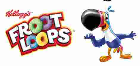
Note this tucan bird. Kelloggs make a cereal with little circles “loops”, and brands it with a name, Fruit (Froot) Loops here. Then they associate an image with that brand so as to build the link between the two. In the image of the tucan, notice the colors. By coincidence, they chose exactly the colors in the image above from the blog. Two colors of blue, red and orange. Kelloggs spent probably millions of dollars coming up with that image, and it is a good image. But count the actual colors in it. Besides black and white (which are more necessary in any image), there are five basic colors, two blues, red, orange, and yellow.
What we want to note here is how the use of color keeps the image “together visually”. There is balance in the color. Yet at the same time it draws attention to itself to make it memorable or easy to remember.
2. Analogous Colors
These colors are all “beside each other” on the color wheel. Typically there is a single one that is more outstanding or stronger than the rest. This would be the base color, and the rest would be other colors that go with them. The disadvantage with choosing these colors is that there is no contrast, and contrast draws attention to the contrast. Compare the diagonal color lines here and above (#1) and you will see how the orange draws attention to it better than any of the greens in number 2.
Analogous colours are those that are next to each other in the colour wheel. There is normally one dominant colour within this set, and it’s good to choose colours either side of this one to make up your palette. It is very easy to create a good palette with this system but you can sometimes lack contrast, making it harder to grab attention compared to using the complementary colours. You should stay away from using warm and cool colours together with analogous colour schemes. —sparkol.com
![]()
As the blog notes, using analogous colors is very difficult because there is little contrast. Here note in the Weetabix logo, that these are all beside each other on the color wheel, different shades of yellow and orange. While this works, it is hard to get it right, or to get it to work well. Basically you are dealing with a “black and white image” (no contrast except in two linked colors or greys) but instead this has the two linked colors (yellow and orange), and the contrast is as if it were black and white.
In slide presentations, this is possible, but you really have to think a lot and play around with it in order to get it to look good. Other options are available that are easier to implement.
![]()
Note here in the Elmo logo/ad the colors are very close to one another on the color wheel. These colors add a different kind of element to the image, that of tranquility and peace. Contrast shouts, but gradient colors seem set at ease. This is necessary in a presentation so that everything isn’t always “shouting”.
3. Monochromatic Colors

Note that my comments on number 2 Analogous colors apply here. This is for very low contrast images. While it doesn’t “grab your attention”, there may be places and occasions that you want this. There is a point of over emphasis, and this is bad in general. If you ever watch a youth video, which is “in your face”, you will be bombarded constantly with emphasis, and when that happens, nothing is emphasized. Ever read a web page or email where the author put EVERYTHING IN CAPITALS? The use of capitals can give emphasis, but if everything is emphasized then nothing is emphasized.
![]()
There is a strategy in play here, and it is to go up and down. So you have valleys and mountain peaks in your presentation in which you let the viewer “rest” and then “emphasis”. The resting parts are those that should use analogous or monochromatic colors, because these don’t strongly emphasize. What you want to drive home, should be strongly contrasted colors. Look at the Cirrus logo, and you will notice that there is no contrast between the colors. Being a bank, it is wanting to portray a more serious, conservative, and reserved image, and so no startling color contrasts like the Fruit Loops logo above.
Monochromatic means one colour. A monochromatic scheme is simply one that uses variations in shade or tint of the same hue (or colour). This scheme is elegant and very easy on the eyes because there are no strong contrasts. It works well when used to create an overall mood for your scribe but again, it can be a struggle to highlight different areas. Sometimes you’ll see a single colour being combined with neutral colours like white, black or grey for a very classy, clean style.
4. Split Complementary Colors
These final categories produce some of the more advanced colour palettes. For an effect like the example above, choose one colour and combine with two others equally spaced from its complement (the original). Split-complementary gives a good balance between the contrast of complementary colours and the soothing appeal of analogous or monochromatic colours. Using one main warm colour as the accent colour and a range of cooler colours generates the most attractive outcomes.
The difference between split complementary and triad (below) is that there is a main primary color (purple in the example above), and the other two complementary colors are not exactly equidistant one from the other. The two complementing colors are closer to each other than the primary color.
![]()
In this Mastercard logo, notice that the red and orange are not equi-distant one from the other as they are from the blue.
![]() Again in this Gatorade logo we see the green as the primary color (notice that the name is in Green), and the two shades of orange and red are closer to each other on the color wheel.
Again in this Gatorade logo we see the green as the primary color (notice that the name is in Green), and the two shades of orange and red are closer to each other on the color wheel.
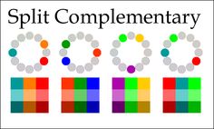
Notice the combinations of this image I found on the Internet of Split Complementary Colors. If you meditate on these color combinations, you will see where it seems familiar. These combinations show up together often in things in our life, like quilts, shirts, etc.
5. Triad Colors

Try making a triangle on the colour wheel, so that the three colours are equally spaced out. It won’t be as striking as using complementary colours but will give a strong contrast whilst still retaining an appealing balance of colour. Again, it’s wise to make one of these colours the main colour you use.
Here you see the high contrasts between the color elements in this color set. The key here is to use a three way contrast, to get as much emphasis as possible between the colors. This kind of image “yells at you”. The contrast is high, but this may be what you want at the moment.
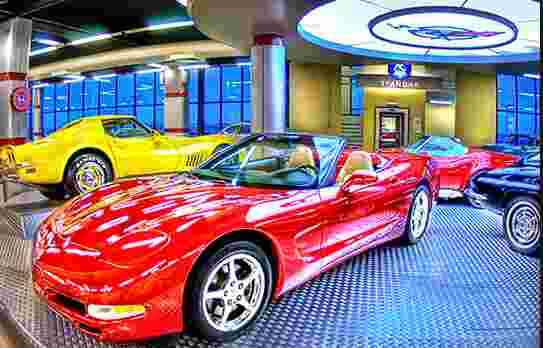
What do you notice about the image of the two cars? The picture is an excellent picture, and it has blue-yellow-red. Of the three colors, the yellow and blue are more sedated, and the red more the dominant color. Which color is used for the background? The blue, the most sedated of the colors. Which color is primary focused or important car? Red. Color is used to emphasize things within your image, and thus in a slide presentation, it should be wisely used also.
![]()
Notice in the United Way logo that they took three opposing colors on the color wheel, and shifted the blue to purple. They actually use a gradiant effect between them. Although this in theory works, I do not like their choice of colors. A blue would have been better than a purple, but they probably were going for something different.
![]()
Notice in the Burger King logo that again these colors are precisely split complimentary colors. I actually like the red in the BK logo better than the red in the blog color set. There is something that calls attention to the logo that is pleasing, oh wait, maybe that is just because I like whoppers. Anyway, the colors are empatic and balanced.
In creating a presentation you need to use the theme colors to visually bind elements together. This is down by keeping the same color elements in your color set popping up through your presentation.
The blog gives the following recommended helps/websites.
Useful colour tools
Adobe Kuler is a handy tool for testing out different colour schemes. You can also save your picks and come back to them later.
Colour Scheme Designer gives you the option to see an example of your colour scheme in action.
Pictalous suggests colours to go with images that you upload, making it easy to build a palette around an image, logo or other reference point.
COLOURlovers is a global community where people create and share palettes and patterns, and talk about the latest colour trends.
Hailpixel is a delight to use – mouse around the screen to change the spectrum and click when you find something that you like.